aRTIE ART GALLLERY APP
Overview
Artie is an app for people to easily find information and purchase tickets to exhibits and events at a fictional municipally owned art gallery.
This project is part of the Google UX Design Professional Certificate offered on Coursera.
Challenge
Art Gallery apps can be overwhelming, making it difficult for users to find information about the location, current exhibits and upcoming events. Additionally users should be able to purchase tickets easily and have access to them on their mobile devices.
Role
Product Design, Visual Design, UI Design, Research, Wireframing, Prototyping, logo and icon design
Approach
I began by conducting thorough user research to identify pain points and develop personas, while also doing a competitive analysis of existing art gallery apps. Using these insights, I created initial wireframes and low-fidelity prototypes, which I tested with users to uncover usability issues. Based on these interviews and observations I refined the design and created high fidelity prototypes incorporating visual elements and addressing user needs. After additional usability testing, I made final adjustments before completing the design, ensuring it was both user-centered and aligned with business goals.
Results
The Artie app allows users to easily find and browse exhibits and events at the art gallery and purchase general admission and events tickets.
Understanding the User
My goal was to find out who the users of the app would be, how they use the art gallery spaces and what information would be desired and what information would be most essential. I conducted interviews and created journey maps, personas and empathy maps
Empathy Map
User Interview Questions
What is the main information you would be looking for in the app?
Do you already have an idea of what you will see at the gallery?
What do you want to know prior to visiting?
How often do you visit this art gallery?
Do you visit mostly visit with friends, family or solo?
Persona
Competitive Analysis
In order to understand the art gallery space I conducted a competitive analysis of existing art galleries and their apps. The apps I reviewed were for The Royal Ontario Museum, The National Gallery of Art (Washington, D.C.) and The Vancouver Art Gallery.
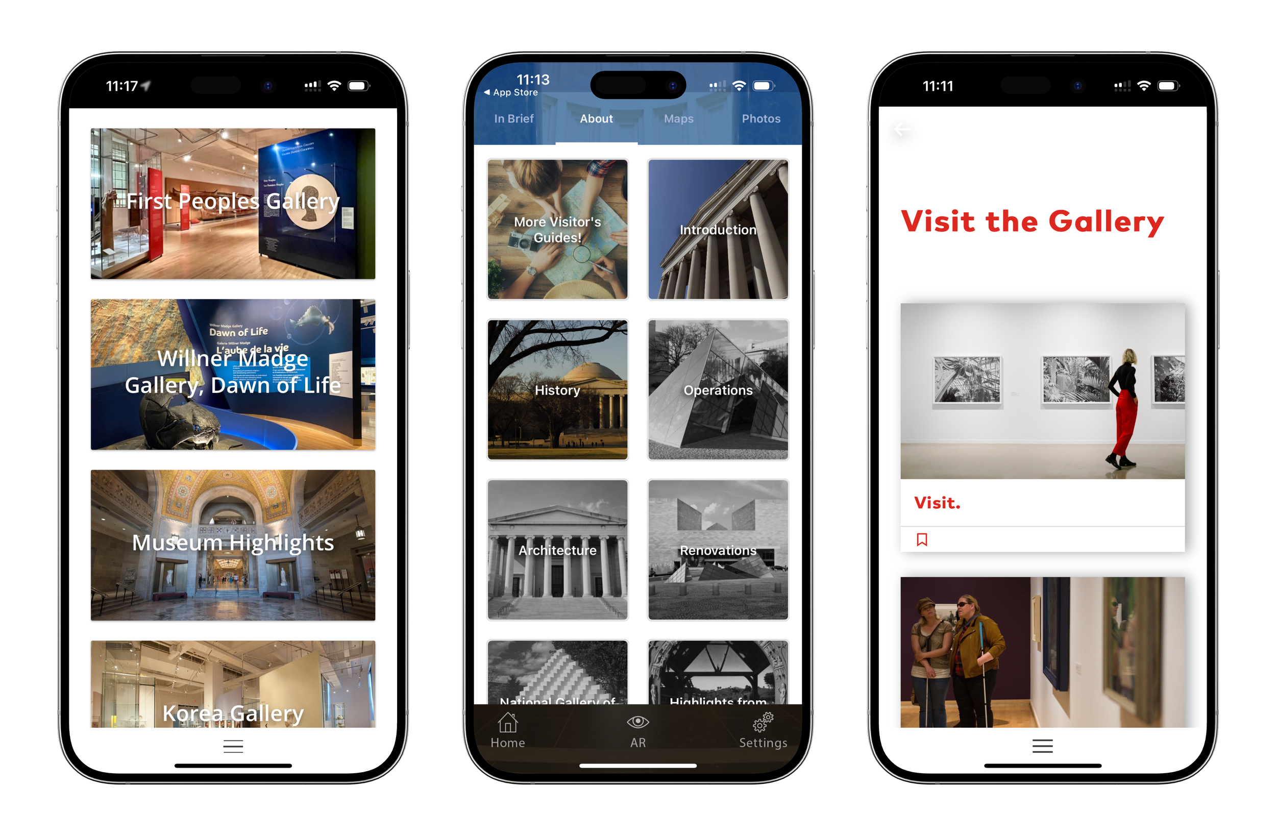
These apps all have some information on current, past and upcoming exhibits with some having too little and others, arguably too much information. Another common issue is the use of text over very busy and detailed images which is overwhelming to the user and causes an issue with accessibly since text is then difficult to read. Additionally this takes away the strength of the images.
Paper Wireframes
Using the information I gathered from users and the competitive analysis I worked through ideas creating paper wireframes.
Low-fidelity Wireframes
Having created different options in paper wireframes I moved on to low-fidelity digital wireframes. I refined the layouts and created interactive prototypes.
User Flow
Here I have created a user flow showing the process of browsing, selecting and purchasing a ticket which can be saved in a digital wallet.
Usability Study Findings Round One
Using my low-fidelity prototype I asked participants in the usability study to complete various tasks while they talked me through their thoughts on the app. I also observed how easily they were able to complete tasks and their thoughts.
Based on participant feedback I changed the drop-down menus to a tab menu. Likewise I took away the hamburger menu and added most of the navigation it contained to the footer. Additionally I enabled customers to continue shopping after adding something to the cart.
Usability Study Findings Round Two
The relatively large images used on the home screen distracted users causing them to take longer to process the information and find the button they were looking to tap on. Additionally the images where visually overwhelming. I solved this problem by adding bold colours. These colours are carried through the app allowing users to be aware of where they are in the app at any given time. For example the pink for Exhibits and orange for Visit
Mockups
Here are mockups showing the selection of ticket for an event and the associated cart, as well as the location page and calendar for choosing a date for a general admission ticket.
Style Guide
The letters in the logo are made up of overlapping landscape and portrait rectangles—a callout to the typical shape and orientations of paintings.
I kept the primary colours to black, white and gray to work well with the many colours of the many works of art that will be showcased in the app.
The secondary colours are bright to create a sense of fun and reduce any anxiety visitors may have about any perceived lack of knowledge when it comes to art since it can be intimidating for many. These bright colours are also a way to guide people through the app and often provide a contrast to the colours in art. All colours are named after commonly used fine art paints.
Mockup 1
A user selecting a date to attend the art gallery and purchasing a ticket.
Mockup 2
Looking at exhibits and reading about a specific exhibit.
Mockup 3
Perusing events and selecting a ticket to purchase.
Takeaways
The app I created allows users to quickly and easily find suitable exhibits and events to attend, while showcasing the art available to see at the art gallery and making it easy to buy tickets and know how to get there.
Next steps
To flesh out the app I would do further usability testing with the current design and incorporate feedback, be it UI elements, navigation etc. Finally I would look at integrating new features, perhaps curator interviews tours or ways to participate with the gallery at home.


